Google has two new smartphones, the Pixel and Pixel XL, and these are the first that Google says it has designed on its own in terms of both hardware and software: It shows. These are great-looking devices that also feel excellent when held, with industrial design that clearly inherits some of its sensibilities from Google’s work with the Pixel Chromebook, and recalls last year’s Nexus lineup, but that goes beyond, too.
The Pixel is a device with a 5-inch display, and the Pixel XL has a 5.5-inch screen, but both actually feel (and are) slightly smaller than the iPhone 7 and 7 Plus in terms of footprint (though slightly thicker, too), thanks to a lack of any hardware buttons on the face, resulting in a device that feels smaller in the pocket and in the hand.
Displays on the Pixel (1080p) and the Pixel XL (Quad HD) both look great, with deep blacks thanks to the use of AMOLED screens, and both benefit from the new Pixel Launcher, which makes the software navigation buttons present in Android smaller, and which also has smaller, rounder icons throughout and a new Google launcher that takes up less space. The end result of all these changes is a focus on just how much real estate the screen has to offer, which works well with rich images used as backdrops.

pixel20

pixel19

pixel18

pixel17

pixel16

pixel15

pixel14

pixel13

pixel12

pixel11

pixel10

pixel9

pixel8

pixel7

pixel6

pixel5

pixel4

pixel3

pixel2

pixel
The backs of the Pixel phones might represent Google’s most unique design choice, with a broad, glossy plate occupying the topmost portion of the back of each. The fingerprint sensor is located in the middle of this, while the camera is located up and to the left corner, where it manages to occupy a smaller space than you’ve probably seen on smartphones in recent memory — and which doesn’t include any kind of bump jutting from the phone, as Google was quick to point out in their presentation today.
Throughout the OS, performance was snappy, more so than I can recall on any other Android device. Google taking ownership of hardware design and tailoring software to components like processors probably has a lot to do with this general UI smoothness.
Likewise, the new Google Assistant system-wide features are fast and responsive. They handled queries well even in the loud demo area, and I was impressed especially by the contextual features that let you ask follow-up questions — I couldn’t confuse it in my limited trials. Assistant seems almost like a game in Allo, the standalone messenger app launched by Google recently, but as a system-level feature, it feels much more like the beginning of a significant UX shift.
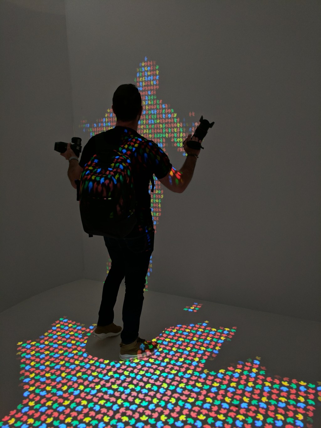
The other standout feature here was the camera, which did very well in conditions that were far from optimal for taking pictures. Below, you can see an image of me dancing like an idiot in low light that looks great, with next to no visible noise.
The Pixel and Pixel XL are both very compelling devices, and definitely mark a departure point for Google’s Android hardware. Whether that’s enough to make them hot sellers when they start shipping October 20 remains to be seen, but it won’t be for lack of trying.

No comments:
Post a Comment