OnePlus 3 design and build quality
While the OnePlus One was a large, sandstone-textured performance beast, the OnePlus 2 had a more refined design. The OnePlus 3 doesn't leap a great distance from its predecessor, but is another instance of where OnePlus has applied small changes to its formula.
In my opinion, the OnePlus 3 is the best-looking piece of hardware OnePlus has made. At 158g, it’s lighter than either the One or the 2, which are 162g and 175g, respectively. From the back, the anodized aluminum unibody, at 7.35mm in thickness, has an attractive minimal design. It's sparse. The call speaker sits above the display, along with the front-facing camera to its left. To the left of the camera is the notification light.
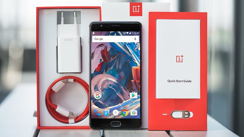
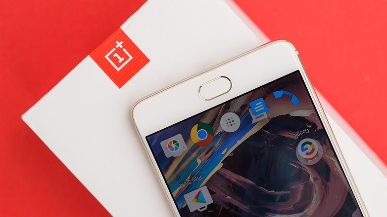
Beneath the display is a fingerprint sensor, which also doubles as the home button. As with every front-facing sensor like this, you’ll need to take hold of the device with two hands to give your thumb an accurate aim. The sensor is fast when you get it right (and you mostly will), unlocking in up to 0.3 seconds, according to OnePlus. The sensor also has bling quality with its glossy ceramic construction.
The OnePlus 3 is the best-looking piece of hardware OnePlus has made
On the left side of the OnePlus 3 is the volume rocker, which sits beneath the notification slider, and on the right side is the sleep/wake button and dual-SIM card tray. All three of these buttons have a pleasingly tactile click. There isn’t much to see on the rear. Beautifully minimal, there is the protruding main camera sensor, flashlight, company logo and the antennas above and below. The combination of hard and soft lines, subtle color variation and even how the anodized aluminum disperses light, give the OnePlus 3 a fine finish.
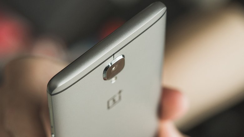
Then there's the size. With a 5.5-inch display, and as with every other phablet, this phone is a little too large to comfortably fit in trouser pockets. Its thinness helps pocketability, but if the issue of practicality is a major one for you, or if you've never owned a phablet before, then you mightn’t get along with the OnePlus 3.
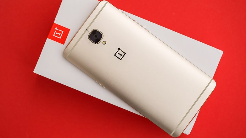
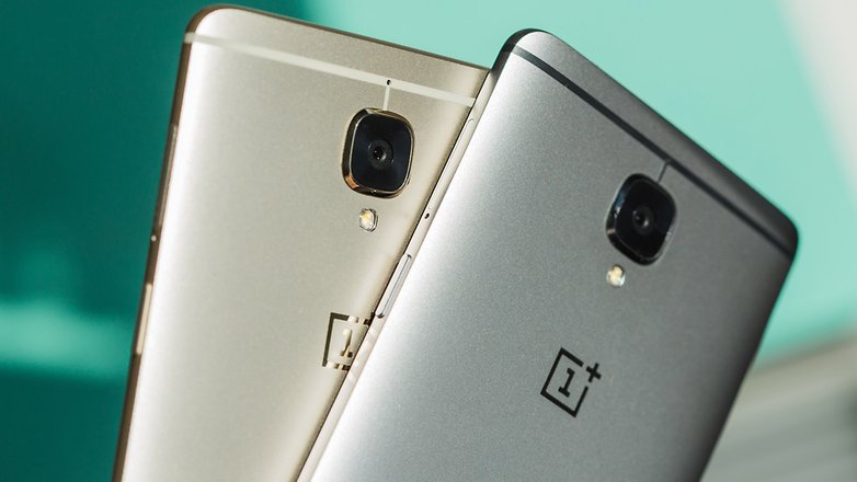
I can’t help but draw a comparison with the HTC 10, as the back of both phones are very similar in appearance. The main difference is that the HTC 10 has chamfered edges, while the OnePlus 3 has rounded ones (see below for a visual comparison). The OnePlus 3 was available in graphite at launch, with 'soft gold’ made available in the US on July 26, 2016. Here are some shots we took at our headquarters on August 9:

No comments:
Post a Comment