ASUS ZenFone 3 design and build quality
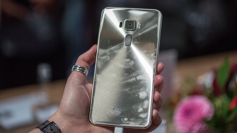
The Zenfone 3 is all glass with a metal frame. In fact, it is quite reminiscent of the Galaxy S6, but it is impossible to confuse them, since both Asus and Samsung clearly brand their devices.
Like the Moto X Play, the Zenfone 3 has a 5.5-inch screen, which also the same as its predecessor, the Zenfone 2. I had the chance to use the Zenfone 2, and can say that, when it comes to the design, Asus has made marked improvements.

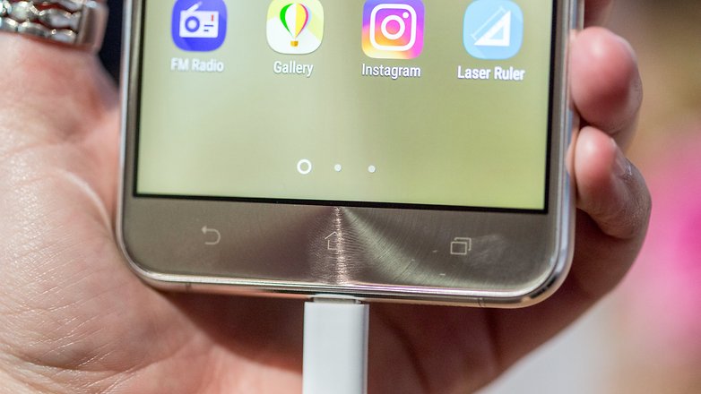
Asus has chosen to stick with capacitive buttons, but it has moved the power and volume buttons the right side of the frame. Now, the line has a fingerprint scanner on the rear panel, precisely where the volume buttons where on the Zenfone 2.
The Zefone 3 e so light and fragile that it feels a little cheap at first
The main camera has a square design, with a small bulge, making the similarity to the Galaxy S6 all the more obvious.

Visually the Zenfone 3 is a clear positive evolution from the design of its predecessor, and the changes can be felt in the hand, too, but in a less positive way. The device is so light and fragile that it feels a little cheap at first, weighing just 155 g. Honestly, that left me very frustrated. When I tried out the Xiaomi Mi 5, which weighs 129g, while it's very lightweight, the device never impressed upon me the same feeling I got from the Zenfone 3, which felt soulless in the hand, despite its robust specifications.
No comments:
Post a Comment